

Monday, December 12, 2016
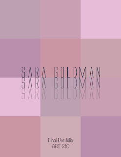
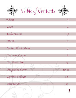
This is my final portfolio for ART 210. It includes every project/ assignment that I have created within the semester. I tried to keep a simple theme with mostly black and white and floral, with a touch of maroon. I also tried to have an interesting title page as well which is why I created the boxes of different colors in random spots. I think that this class really helped me understand Photoshop, Illustrator, and In Design much more and it also helped me appreciate art more. I overall am happy with my experience in Digital Media.
Wednesday, November 30, 2016
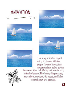
This is my animation project. My collage was all about the beach and I included a Bob Marley quote. So with this project I wanted to create a smooth sailboat sailing across the ocean with a Bob Marley instrumental song in the background. I had many things moving, the sailboat, the water, the clouds, and I also created a sun and sun rays.
Monday, November 14, 2016
Tuesday, November 1, 2016
Monday, October 24, 2016
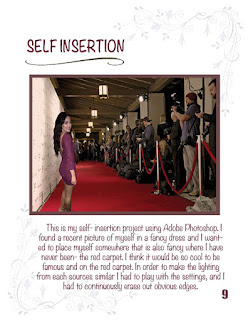
This is my self- insertion project. I found a pretty recent picture of myself in a fancy dress and I wanted to place myself somewhere that's also fancy where I have never been- the red carpet. I think it would be so cool to be famous and on the red carpet. It was hard to find a picture of red carpet with paparazzi actually taking pictures without a celebrity already in my place, so I just chose this one. In order to make the lighting from each sources similar I had to play with the settings for a while, and I had to keep re-doing my picture by erasing out obvious edges, but overall it wasn't too difficult. It didn't need too much shadow edits because the original photo cut off my feet so I put my picture towards the bottom of the page. However, I still like illustrator more than Photoshop.
Wednesday, October 19, 2016
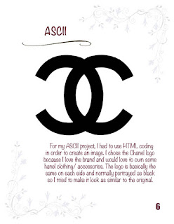
For my HTML assignment I chose to do a Chanel logo. I love the brand however I don't have that kind of money to afford that. The logo is basically the same on each side and it is normally seen as black so I just left it as that so it would look as similar to the reference picture as possible. It was a little difficult because I'm not too familiar with coding and getting the little kinks out took a while but I am happy with how it turned out! The reference picture is below the picture that I created.
context.beginPath();
context.moveTo(100, 200);
context.quadraticCurveTo(160, 80, 300, 100);
context.quadraticCurveTo(440, 120, 458, 288);
context.quadraticCurveTo(460, 475, 300, 500);
context.quadraticCurveTo(170, 510, 100, 400);
context.lineWidth = '75';
context.stroke();
context.beginPath();
context.moveTo(650, 200);
context.quadraticCurveTo(630, 152, 580, 120);
context.quadraticCurveTo(505, 82, 420, 105);
context.quadraticCurveTo(285, 160, 285, 300);
context.quadraticCurveTo(285, 455, 450, 498);
context.quadraticCurveTo(575, 513, 650, 400);
context.stroke();
context.beginPath();
context.moveTo(100, 200);
context.quadraticCurveTo(160, 80, 300, 100);
context.quadraticCurveTo(440, 120, 458, 288);
context.quadraticCurveTo(460, 475, 300, 500);
context.quadraticCurveTo(170, 510, 100, 400);
context.lineWidth = '75';
context.stroke();
context.beginPath();
context.moveTo(650, 200);
context.quadraticCurveTo(630, 152, 580, 120);
context.quadraticCurveTo(505, 82, 420, 105);
context.quadraticCurveTo(285, 160, 285, 300);
context.quadraticCurveTo(285, 455, 450, 498);
context.quadraticCurveTo(575, 513, 650, 400);
context.stroke();
Monday, October 10, 2016
Monday, September 26, 2016
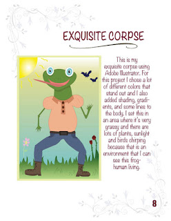
This is my exquisite corpse. For this project I chose a lot of different colors that stand out and I also added shading, gradients, and some lines to the body. I set this in an area where it's very grassy and there are lots of plants and sunlight and birds chirping because that is an environment that I can see this frog-human living.
Monday, September 19, 2016
Logo Critique:
These are two different coffee companies that used certain strategies to prove that they sell coffee. While starbucks only has the word coffee, dunkin donuts actually has a picture of coffee on their logo. These are both two very popular coffee brands and almost everyone knows it when they see these logos, which proves how effective their logos actually are. However, even though I like dunkin donuts better than starbucks, I think that the starbucks logo is much more interesting and creative. The design looks like it took more work and it is more intricate. Dunkin donuts' logo is simply a coffee cup and the name of the brand. The target audience is most likely people over the age of 20, and I believe that each of these coffee brands have successfully reached their age goal because they are both the most popular coffee shops. I like how both of them are limited to only a few colors so it's not so mixed up and it stands out more than others.
Tuesday, September 6, 2016
Subscribe to:
Posts (Atom)